After moving to New York from the Netherlands I was relieved to find out that biking in Manhattan is actually pretty do-able. It’s not really as common as it is in the Netherlands, where it’s often the only means of transportation. Biking is much faster then traveling by car, and more enjoyable then the subway. Add the small risk of being hit by a cab (mirrors and side windows are objects the drivers chose to ignore), and you have a bit of a “thrill-seeking” experience.
Whereas in the Netherlands we have at least three bikes (one racing, one old for in the city, and one broken), owning your own bike in Manhattan is not very practical due to the lack of storage space. Luckily for us Dutchies there are the Citi Bikes: a bike-sharing program with over 10.000 bikes and 600+ stations (and growing).
Where do all the bikes go?
After using the bike sharing system for a while, you start noticing the main problem of bike sharing systems: everybody wants to be at the same place at the same time. E.g. people go to work in the morning - taking a bike from their living area or the place they come off their commute to the location of their workspace. The same happens in the afternoon, which results in some docks always being empty after 08:00 AM and some docks always being full after 08:00 am. Although Citi-Bike employees are working hard to re-stock some of the empty docks, it is mission impossible to do this fast enough during rush hour.
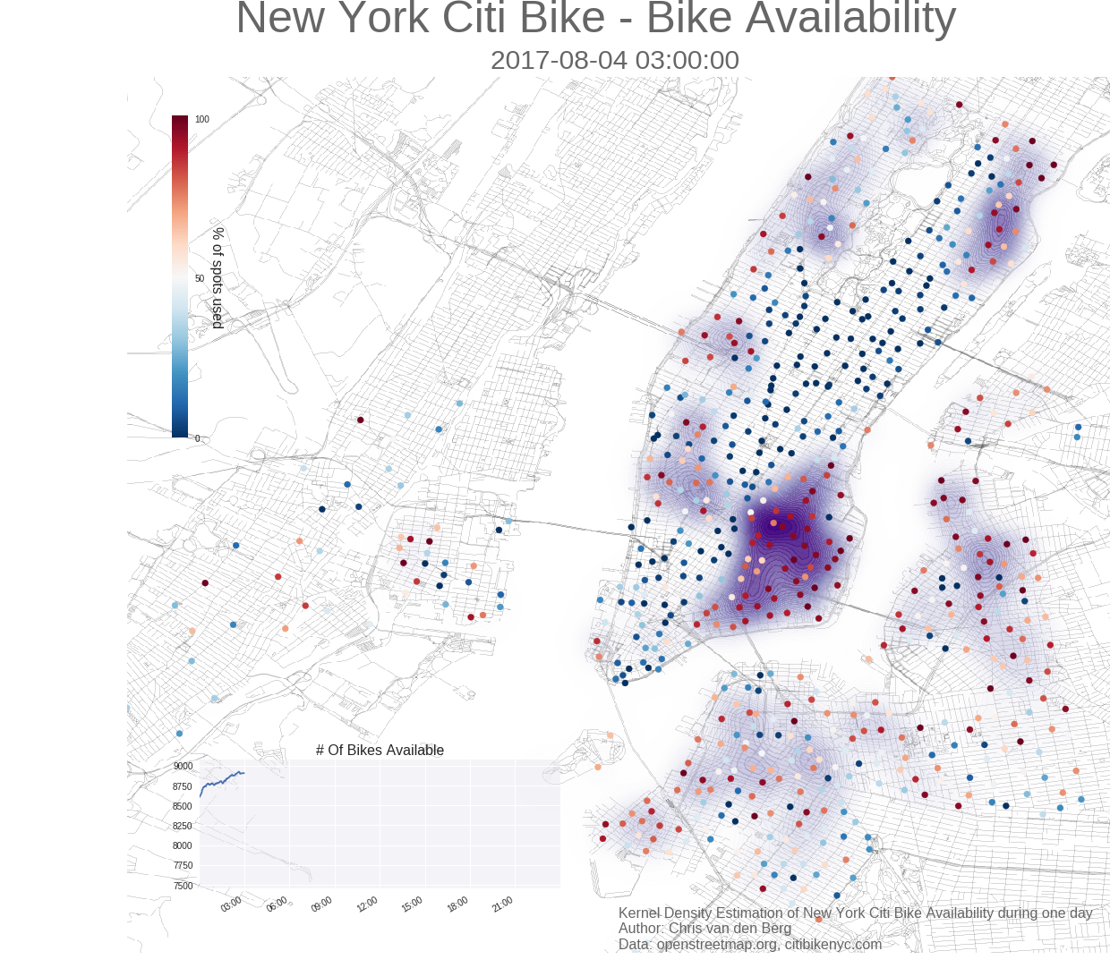
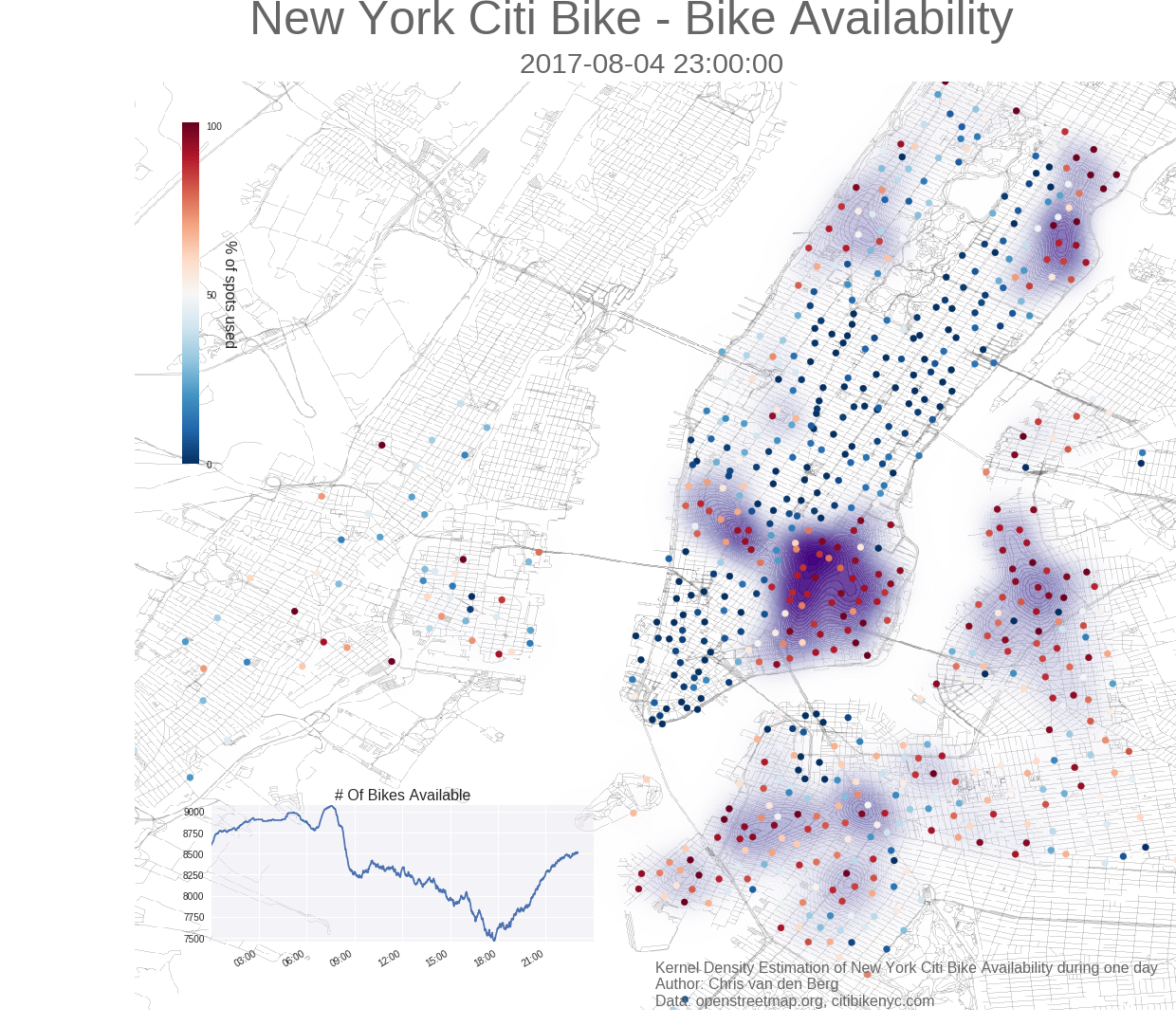
So where are the bikes going during the rush hours? Using the app you get a feeling of certain area’s being depleted completely during certain times, while other areas are fully stocked. However this is just a snapshot in time. For a better overview I decided to plot the bike distribution using a Kernel Denisity Estimation of the probability function. By creating one plot for every minute during the day, and using these as frames in a movie, I was able to get a good visualization of bike availability throughout the day.
One day of Citi Bikes in NYC
Next to the density plot, I’ve added some markers for the location of the docks as well, where the color denotes the percentage of bikes available in that dock (0% means an empty dock, and 100% means a completely full dock). And a plot that displays the total availability throughout the day.
See for yourself where all the bikes go:
What do we see?
Studies show that Citi Bikes are mostly used for commuting, and I believe this animation shows that as well. During the night most bikes are in the upper east and upper west, near Penn station. The highest density by far is on the lower east side.
During the morning rush hour the bikes move quickly to midtown, the financial district, and other work-areas.
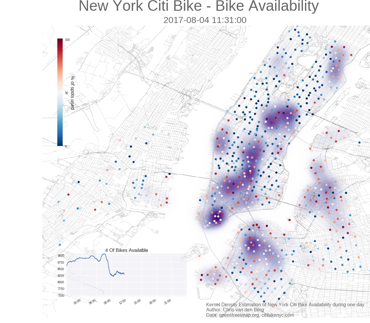
During the afternoon rush hour, the bike stations in these working areas are depleted again. Note that the data used in this animation was on a Friday, which means the rush hour started early.
How it’s made
This visualisation was made in Python, using Pandas, Matplotlib Seaborn, and Basemap.
For the full Jupter Notebook with code click here